Category: publishing

Great Smoky Mountains National Park book wins 2010 Best Books Award

domainхолни маси

Great Smoky Mountains book

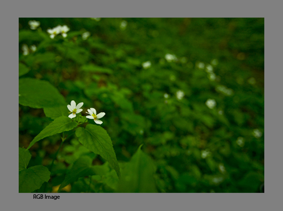
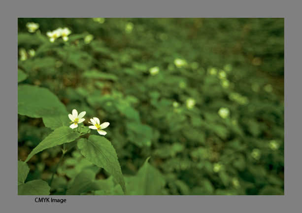
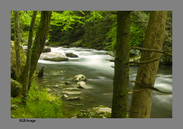
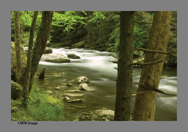
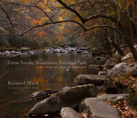
This morning USA Book News announced the Best Books 2010 Awards and my book Great Smoky Mountains National Park: Thirty Years of American Landscapes was honored as the Gold Medal Winner for Best Book: Nature Photography 2010

USABookNews.com, the premiere online magazine and review website for mainstream and independent publishing houses, announced the winners and finalists of THE “BEST BOOKS 2010″ AWARDS (BBA) on October 26, 2010. Over 500 winners and finalists were announced in over 140 categories covering print and audio books. Awards were presented for titles published in 2010 and late 2009.

Winners and finalists traversed the publishing landscape: Simon & Schuster, Penguin/Putnum, Rodale, McGraw-Hill, John Wiley & Sons, Moody Publishers, American Cancer Society, Sourcebooks & hundreds of independent houses contributed to the Best Books Awards competition.

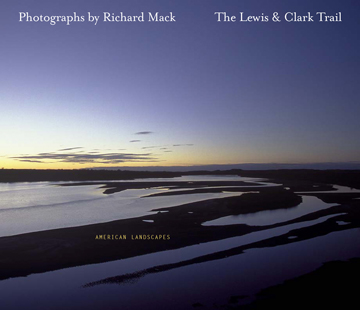
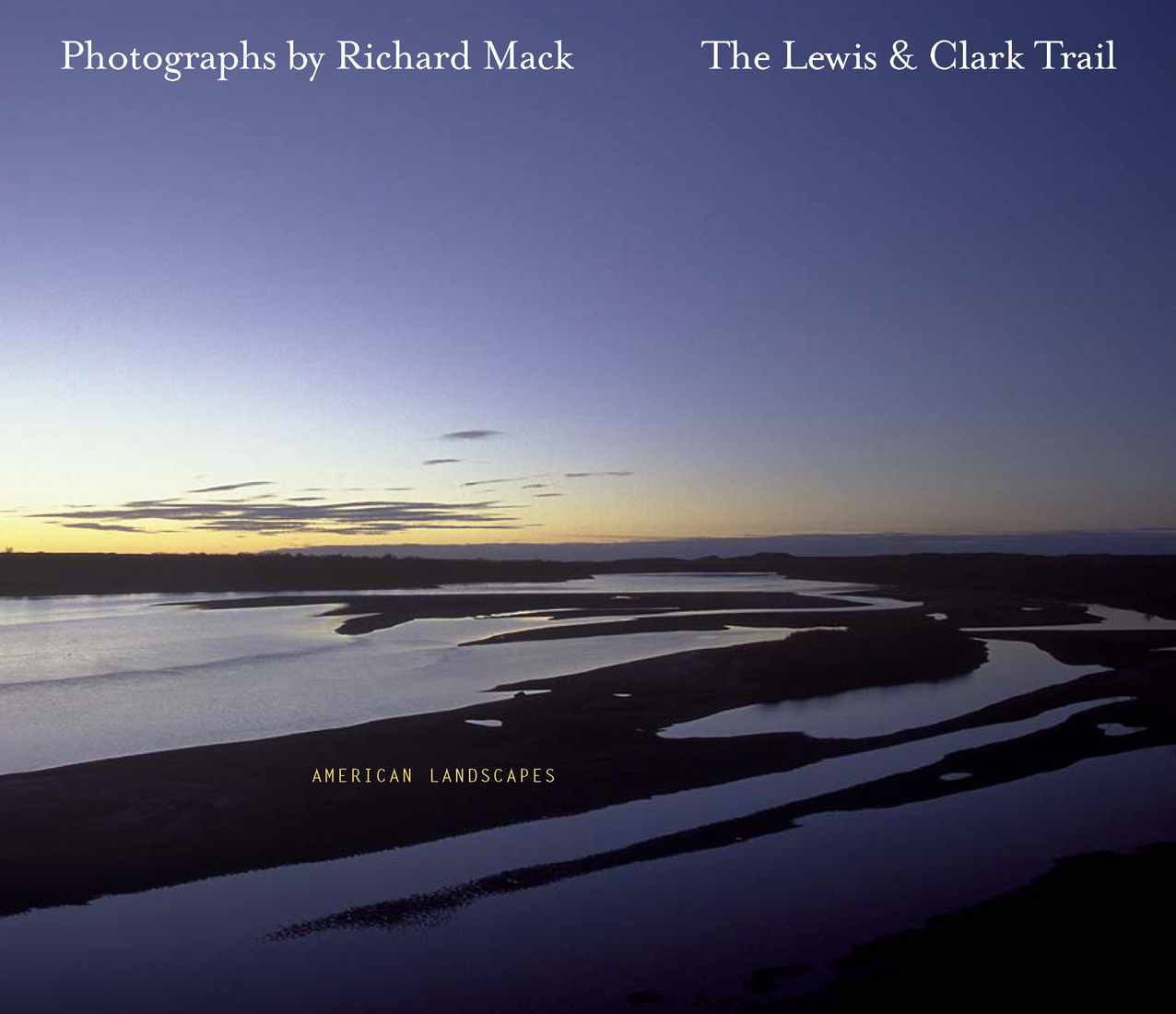
Quiet Light Publishing is honored to have had Great Smoky Mountains National Park: Thirty Years of American, Photographs by Richard Mack, selected as the Best Nature Photography Book for 2010. It is always an honor when others recognize your work, especially when it spans 30 years of photography. To be named the Best Nature Photography book for the year is incredibly humbling.


Pre-Order Great Smoky Mountains National Park: Thirty Years of American Landscapes

Great Smoky Mountains National Park: Thirty Years of American Landscapes

Great Smoky Mountains National Park: Thirty Years of American Landscapes

ISBN: 978-0-9753954-2-4

220 pages, 245 images, 11×13”

Quiet Light Publishing

Publisher’s Price: $60.00

Pre-Order Price: $45.00 (until June 1, 2009)


Four years ago today we released my first book, The Lewis & Clark Trail American Landscapes. As soon as you come out with your first book, the question is…so what’s your next project and when will it come out. Well, now. Kind of. You can now pre-order our second book, Great Smoky Mountains National Park: Thirty Years of American Landscapes. I have been training my lens on the park for just over thirty years so it made sense that my next book would on the park.


I began my quest to become a landscape photographer while on my first trip to Great Smoky Mountains National Park back in 1974 with my future wife, Kathy. I was not then as intense about photography as I am now. I was just beginning my journey and in all honesty wanted to find the closest national park to my home in Illinois. I chose the Smokies and the love affair began – between me and the park and between my wife and I. Since then I have visited many of our national parks, but I continue to be drawn back to the beauty, diversity, and complexity of the Smokies. It is, after all, a park that offers everything: historic buildings and living history, magnificent streams and waterfalls, a variety of old-growth and new-growth forests, large fields and coves with abundant wildlife, and of course, those stunning vistas into “smoke” filled valleys.

Over thirty years, many things have changed, and many others have stayed the same. The Fraser firs on Clingmans Dome have almost been destroyed by the Balsam Wooly Adelgid, yet younger trees now crowd the understory. Portions of the Alum Cave trail were inundated by a landslide during a thunderstorm. Cades Cove is no longer farmed. Logging operations cleared much of what is today parkland. Yet to the inexperienced eye, the places where lumber companies clear-cut mountainsides in the late 1800s and early 1900s are barely perceptible, a testament to both Mother Nature’s ability to regenerate and remove the scars of mankind, and to mankind itself for having the foresight to preserve this remarkable landscape. In some cases, entire species have disappeared from the area, like the buffalo and wolves, or even from the earth entirely as is the case with the passenger pigeon. But other species have been reintroduced. Elk have been returned to Cataloochee and have migrated into other areas of the park. The synchronized fireflies have been around forever, but only in the last 15 years have they become a popular treat if you are lucky enough to catch their 10-day show in early summer.

Some of these changes are reflected in this book, whether a black and white image of an old barn taken in 1976, or one of my last shots of a sunrise as seen from Newfound Gap in November 2008. I hope you will enjoy my vision of Great Smoky Mountains National Park. It is a jewel in our national park system. My wish is that you will come to love, as I do, the details of the leaves, the rush of water in the streams, the colors of the landscape as it changes from season to season.  

You can preview the book using the link: GSMNP Book Preview 

Our release date is July 1, 2009, but pre-orders start today, at the reduced price for readers of this blog of $45.00. So order now, and put the words BLOG in the comment area to insure your discounted price. We will not charge your card until we ship your order. Readers of this blog are the first to be able to order! GSMNP Book Pre-Order 

Thanks! Hope you’ll enjoy this new release! Stay tuned for more as we move forward! 

Richard Mack 


Painful for a Photographer – Converting RGB to CMYK

smnp-20060502-1670-rbg.jpg    smnp-20060502-1670-cmyk.jpg

I am at the point in the Great Smoky Mountain National Park: Thirty Years of American Landscapes book project where it is time to convert the images into the CMYK color space for the press. It is a very painful process. As photographers we see in a full spectrum of colors, shoot for the widest range in the color spectrum, in 16bit Raw files, import them into Photoshop in ProPhoto color space (you do use this now don’t you?) all of which gives us the largest color space we can have. This provides for beautiful images onscreen and in our fine art prints. But the book world uses the color space for commercial presses, the world of four to six color presses and the world of CMYK, a much smaller color space than we work in. So we suffer the long slow pain of watching our colors disappear when we hit the Convert to CMYK button.

Any color out of gamut (outside the target color space) will be clipped into the CMYK color space, which for me in this case is usually the bright yellows and greens of that early morning light in the leaves. So, after getting up early to be there for the golden light, taking care to bring the colors to life in Photoshop and having things look great, we end up cringing as we hit that Convert to CMYK color space. I am converting to the CMYK color my press has specified for their use, basically SWOP coated. So how do you get back some of the colors which have been clipped?

Well, if you look online for answers, you will find everyone has a different opinion. So here is how I have come to process images. Once you have your final RGB file set (and saved), flatten the layers and then take a look at it. Click the Preview button on and off to get an idea of what things will turn into and I have on occasion then upped the saturation of the greens only by about 10% and then converted to CMYK, although this seems to work only occasionally.

As you hit the convert button, please, and this is important, utter the words “bye bye color”.

Most often the beautiful light yellow greens will turn into a cyan bluish color. So what now? I go to the levels and change the cyan levels slightly starting with the middle which I put at 1.00 or 1.15 then adjust the high and low sliders to taste. Then select Hue/Saturation and once again go to the greens and yellows separately and up them 10-20% be careful though you don’t go too far and wash out detail. You might want to also add some black in the greens and/or on the black channel as well. You might find there are more things to try as well, maybe in the curves adjusting each channel separately, or going into the selective colors and adjusting the Cyan and yellow levels in the green layer. Depending on the image you are working on it may take any combination of these actions. Make sure you save it as a different named file – I put CMYK at the end of the file name. No most likely you still won’t be happy with the results but they should be fairly acceptable.

smnp-20060502-3109-rgb.jpg     smnp-20060502-3109-cmyk.jpg

One last thought. Don’t go back and forth between the original file or transparency and try to match it. You won’t be able to. All you can do now is make it look as good as you can given the smaller color space you have to work with. While this is something all of us photographers hate to think about – our work not being shown at it’s absolute best, have faith that your printer will be very good at what they do and things will turn out alright – especially if you’ve selected the right printer to work with. And remember, every photographer who has had work printed in any form has faced this dilemma at some point. I happen to be lucky enough to have an original Ansel Adams print, one which is also in one of his early books. While the reproduction in the book is very good, it does not compare with the original print. So he had the same problem.


On my last book, The Lewis & Clark Trail American Landscapes I worked with Stinehour Press and they made the separations from the original transparencies. There I had the magic of John Stinehour to help. They have, sadly, gone the way of many presses in the United States and are no linger around. I could say to John – “It needs your magic to make it pop” and he would do something and it would happen. There are moments in this process I wish I had John and his wisdom sitting next to me telling me what to do. The Great Smoky Mountain National Park: Thirty Years of American Landscapes book is mostly digital images which I am now converting for our new printer CS Graphics. And I am confident they will be able to make these images as beautiful as before, but I still hate it when I push that Convert to CMYK button.


Peace,

Richard Mack


A Sad Day for Publishing

The Lewis & Clark Trail American Landscapes


I returned from my shoot last week in Great Smoky Mountain National Park to learn the very sad news that the finest book printer in the US, The Stinehour Press, had ceased operations. They have been lauded by, among others, the Washington Post, as the finest fine book printer – and by the many printing industry awards they have won over their 50 year run. Their client list included the Art Institute of Chicago, the San Francisco Fine Art Museums, the Museum of Modern Art, the Museum of Boston, the Norman Rockwell Museum, The Getty Museum, the Guggenheim, the Whitney and the Smithsonian. Publishers included Random House, Little-Brown and many university presses, including Harvard, Stanford, Yale, Princeton and Dartmouth. They have also printed the works for many photographers, and of course Quiet Light Publishing as this is where my book The Lewis & Clark Trail American Landscapes was printed.


We chose them for several reasons. One they were the best. They had shown us proofs on our paper selection using our images to prove they could deliver – even before we accepted their quote. Once we were there we could see first hand why they were/are the crafts men and women of such high caliber. Every one of them was dedicated to our project, from the front office, to production to the pressroom. And everyone had the right to say, wait, we need to do this before moving on – even as we were on press. Their quality and dedication to my book was never ending. And we quickly became part of the family there in their corner of Northeast Vermont. We dined at some of their homes, went to places around town with them and became friends. And I was only one of many hundreds or thousands of books they have printed over their 50 year run. It saddens me that their dedication to publishing has come to an end and that these folks will now be looking elsewhere for work.

One of the reasons they cited for their closing is the high competition with overseas printers. The cost of printing overseas has made it so many publisher’s choose this route. We considered it. And rejected it for two reasons. On price, when considering the cost of travel overseas for the print run, and the cost of shipping finished product back, they were within nickels on the price per book. And equally important – they were here – in the US. I have always thought we should support US companies such as The Stinehour Press when we can. A company which put quality first and treats their employees and customer’s with respect. Besides, it only seemed reasonable to have a book about America and its history and landscape be printed here.

But in the end, it seems, the cost of printing overseas did overcome them. They mentioned in their press release they could not compete any longer with overseas pricing when they can print books for what their cost for just the paper would be. This can not just be a labor cost problem. I can only imagine what the cost of health insurance for 26 employees and their families must have been. Imagine if that cost was taken out by having universal health care. Maybe then they would be able to stay and continue their craft of making some of the finest books published. And while some may knock me for being nostalgic here, why is it that we always rush for the lowest price on everything? Doesn’t quality stand for something? I realize the digital age has provided a cheaper, faster way to be able to send off PDF’s of a project to printer’s, have them make a few pages of proofs to be ok’d and then print on demand. But do these books give you the same feel in your hands as one which is handcrafted? Maybe the fact that they worked from 6am to 4pm instead of around the clock put them in a different league, personally, one which I admire. (Oh, and yes, if they were in the middle of a run they did finish it – they didn’t just stop the presses until tomorrow). And that meant family was as important in their company philosophy – at least from what we observed in our time in the Northeast Kingdom. And it showed in their product. Our book The Lewis and Clark Trail American Landscapes, has not only won over a dozen awards, I see it in the faces and hear it in the words the first time someone picks up the book for the first time. Right away they are impressed with the quality. There always seem to be sigh’s of wow, or “hey look at this”, as they show it to someone else. Quality does stand out. It should be what we all strive for.

As Warren Bingham, CEO of The Stinehour Press said in their press release, “These are not good times for American manufacturers. I hope we know the full cost of what we’re buying as a society. When lowest cost is always the determining factor, it might be higher than we think.”

Something to think about. After all, if we can help out Wall Street and their CEO’s when they make unwise structures of mortgages and derivatives, or give huge tax breaks to oil companies making 45 billion in profits – more than most countries gross national products, why can’t we invest in companies worthy of our investment? Companies that care about quality and their employees and customers? Those small companies which really are what America is all about – ingenuity and quality. It is something I don’t understand. It is something 26 people and their families in the northeast now probably wonder about as well.

Yes it is a very sad day for publishing, especially of fine art book publisher’s, but it is also a very sad day for America.

Post Script – When we were at the Stinehour Press we did our first “blog” as a series of posts each day on our website. I will reissue this post today so you can see exactly what it was like to be there. You can find it at www.mackphoto.com/Vermont.html