Category: digital

Statue of Liberty

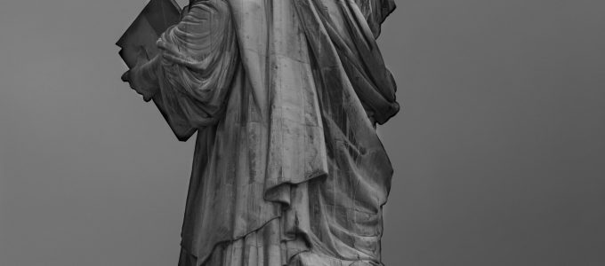
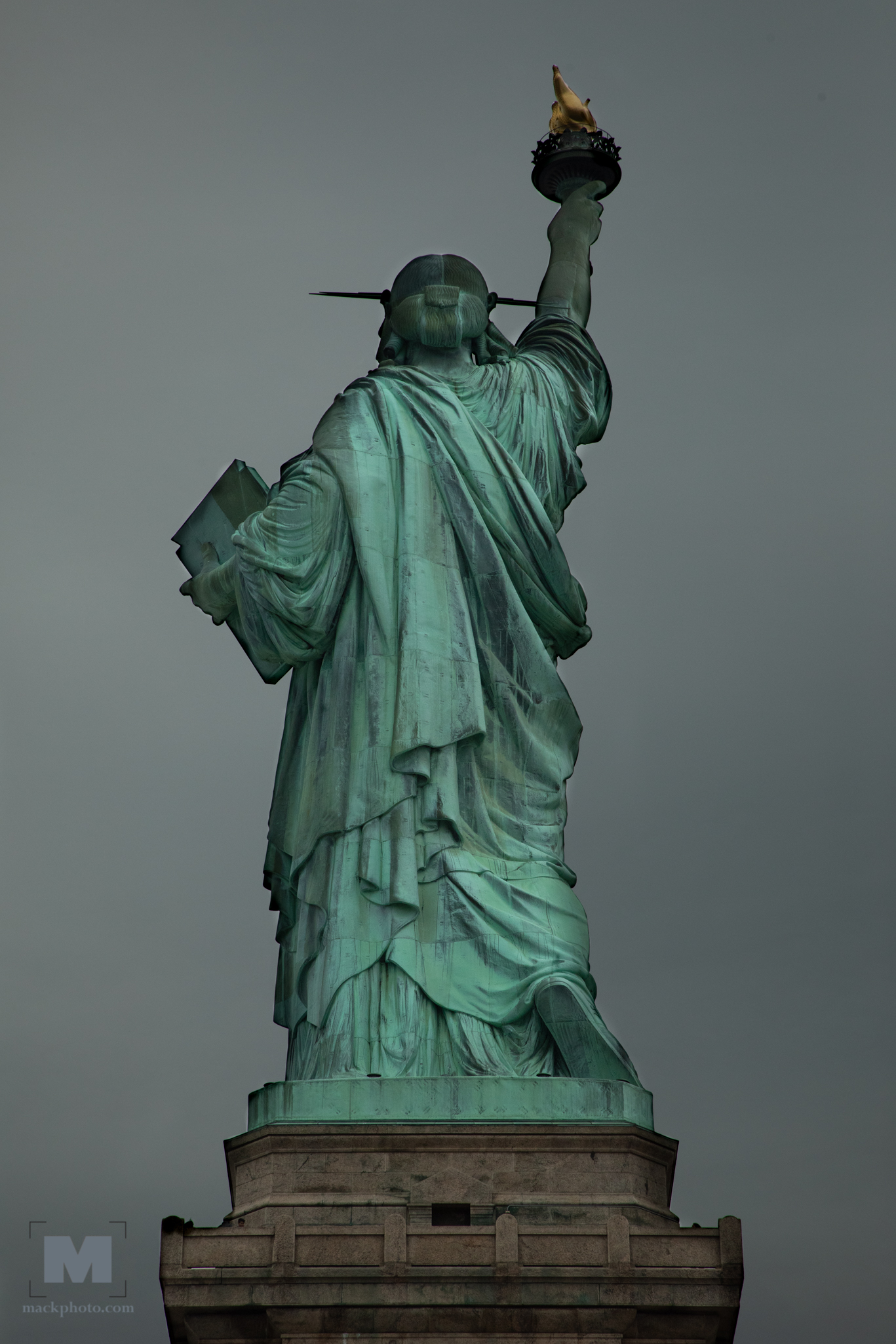
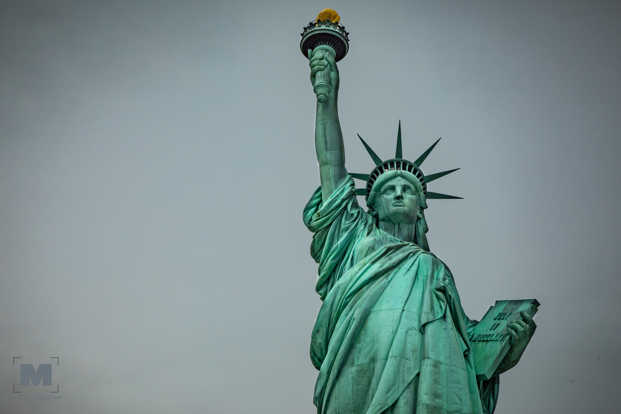
I recently went to the Statue of Liberty while in New York. While it was a cold and blustery day with dark skies overhead it is always a compelling place to visit knowing that millions of people had their first glimpse of Lady Liberty as they came to this nation. I did not know what kind of shots I would get on a day like this but found closeups of the statue more compelling than further ones. While I did not have a lens longer than 105mm it was long enough to get in close enough. Had I carried my 28-300mm with me I would have been able to get even closer for interesting detail shots. Next time I won’t worry about the weight.

To me Lady Liberty stands for our nation, or at least for what I believe our nation is. One of welcoming all, caring about all, working with other nations to fix problems from climate change to nations with health, food, and education issues. We are a nation for good. Or at least we used to be. Currently some folks want to go back to an isolationist idea, turning our backs on the world. Maybe that is why I like the image from the back of Lady Liberty so much – it represents where I think some people in this country think we need to be. I disagree wholeheartedly. In many ways it is a sad image. From the front it sends the idea we still accept what the Statue of Liberty stands for – Liberty for All.

As for the images, much like Ansel Adams taught photographers, see your image before you click the shutter, know the exposure and what filters you need to get the tones you want in a black & white image. In my case I knew I would darken the sky and lighten Lady Liberty to bring out the contrast I imagined on such a gray day. It is easier with today’s digital imaging to know before hand what you want it to look like and then make it happen in the digital darkroom. Although maybe not as fun as watching a print come to life in the developer.

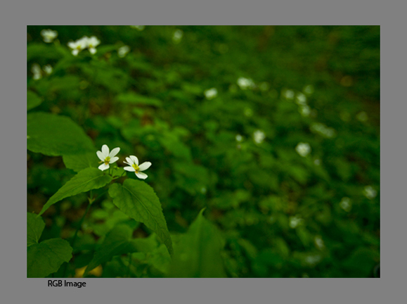
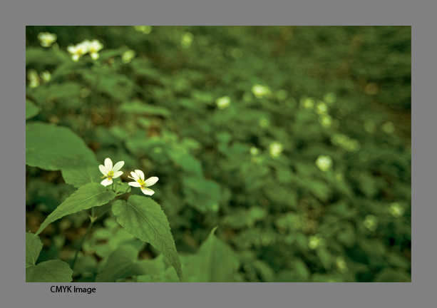
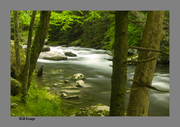
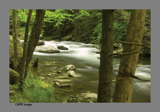
And the big plus is shooting in digital you get both a color and B&W version of the image! Sometimes it is very hard to decide which you like better! You go with a perceived idea and come back with some unexpected images you may like better.

Enjoy,

Richard

#richardmackphoto #NewYork #StatueofLiberty #Canon #Canon5DMarkIV #NPS


Painful for a Photographer – Converting RGB to CMYK

smnp-20060502-1670-rbg.jpg    smnp-20060502-1670-cmyk.jpg

I am at the point in the Great Smoky Mountain National Park: Thirty Years of American Landscapes book project where it is time to convert the images into the CMYK color space for the press. It is a very painful process. As photographers we see in a full spectrum of colors, shoot for the widest range in the color spectrum, in 16bit Raw files, import them into Photoshop in ProPhoto color space (you do use this now don’t you?) all of which gives us the largest color space we can have. This provides for beautiful images onscreen and in our fine art prints. But the book world uses the color space for commercial presses, the world of four to six color presses and the world of CMYK, a much smaller color space than we work in. So we suffer the long slow pain of watching our colors disappear when we hit the Convert to CMYK button.

Any color out of gamut (outside the target color space) will be clipped into the CMYK color space, which for me in this case is usually the bright yellows and greens of that early morning light in the leaves. So, after getting up early to be there for the golden light, taking care to bring the colors to life in Photoshop and having things look great, we end up cringing as we hit that Convert to CMYK color space. I am converting to the CMYK color my press has specified for their use, basically SWOP coated. So how do you get back some of the colors which have been clipped?

Well, if you look online for answers, you will find everyone has a different opinion. So here is how I have come to process images. Once you have your final RGB file set (and saved), flatten the layers and then take a look at it. Click the Preview button on and off to get an idea of what things will turn into and I have on occasion then upped the saturation of the greens only by about 10% and then converted to CMYK, although this seems to work only occasionally.

As you hit the convert button, please, and this is important, utter the words “bye bye color”.

Most often the beautiful light yellow greens will turn into a cyan bluish color. So what now? I go to the levels and change the cyan levels slightly starting with the middle which I put at 1.00 or 1.15 then adjust the high and low sliders to taste. Then select Hue/Saturation and once again go to the greens and yellows separately and up them 10-20% be careful though you don’t go too far and wash out detail. You might want to also add some black in the greens and/or on the black channel as well. You might find there are more things to try as well, maybe in the curves adjusting each channel separately, or going into the selective colors and adjusting the Cyan and yellow levels in the green layer. Depending on the image you are working on it may take any combination of these actions. Make sure you save it as a different named file – I put CMYK at the end of the file name. No most likely you still won’t be happy with the results but they should be fairly acceptable.

smnp-20060502-3109-rgb.jpg     smnp-20060502-3109-cmyk.jpg

One last thought. Don’t go back and forth between the original file or transparency and try to match it. You won’t be able to. All you can do now is make it look as good as you can given the smaller color space you have to work with. While this is something all of us photographers hate to think about – our work not being shown at it’s absolute best, have faith that your printer will be very good at what they do and things will turn out alright – especially if you’ve selected the right printer to work with. And remember, every photographer who has had work printed in any form has faced this dilemma at some point. I happen to be lucky enough to have an original Ansel Adams print, one which is also in one of his early books. While the reproduction in the book is very good, it does not compare with the original print. So he had the same problem.


On my last book, The Lewis & Clark Trail American Landscapes I worked with Stinehour Press and they made the separations from the original transparencies. There I had the magic of John Stinehour to help. They have, sadly, gone the way of many presses in the United States and are no linger around. I could say to John – “It needs your magic to make it pop” and he would do something and it would happen. There are moments in this process I wish I had John and his wisdom sitting next to me telling me what to do. The Great Smoky Mountain National Park: Thirty Years of American Landscapes book is mostly digital images which I am now converting for our new printer CS Graphics. And I am confident they will be able to make these images as beautiful as before, but I still hate it when I push that Convert to CMYK button.


Peace,

Richard Mack